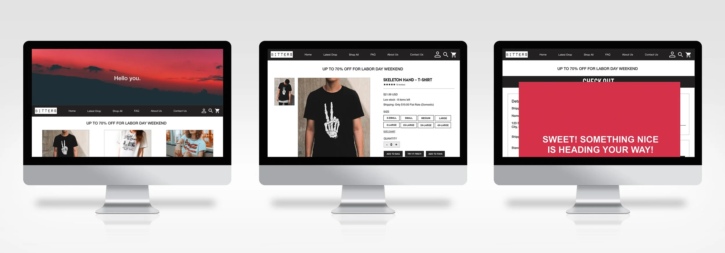
Bitters Co. is a cutting-edge t-shirt and skateboarding company that combines edgy designs with top-notch quality to create apparel and gear that resonate with the youth and the young at heart. The aim is to become the go-to website where consumers can experience fun and enjoyment while shopping, offering the best in retail therapy.
Case Study Overview
There is a lack of clothing websites that offer both versatility and a user-friendly webs tire experience. Additionally, customers seek reliable sizing charts they can trust, as past experiences have left them feeling disappointed.
The Challenge
The Role
UX/UI Design & Research, Wireframing, Prototyping, Usability Testing
Design Bitters clothing website to become the go-to destination for individuals seeking a seamless and enjoyable online shopping experience. Additionally, implement a unique and innovative method for customers to try on t-shirts, setting the company apart from the rest.
The Goal
The Software
Adobe XD, Illustrator, Photoshop, Zoom
User Research
I conducted user interviews to gain insights into their preferences and requirements for a clothing store website. It became evident that many users feel overwhelmed by the excessive amount of information presented to them. A significant portion of the user base leans towards a more visual experience, seeking a relaxed and enjoyable browsing experience in the ever-evolving fashion world. Many users have faced frustrations due to unreliable size charts and desire a straightforward and user-friendly navigation system for their browsing needs.
User Research: Pain Points
When a website becomes too overwhelming to navigate, numerous users opt to leave in search of a more user-friendly shopping platform.
Navigation
The size charts provided on clothing websites can be quite inconsistent, leading users to perceive them as misleading.
Interaction
Experience
Purchasing clothing online should be an enjoyable experience, not a chore.
Readability
Previous experiences have contributed to the user's difficulty in reading text clearly.
Persona #1: Say hello to Jean Luc!
Jean Luc, a 30-year-old illustrator, works long and demanding hours at a design company. To relieve stress from his demanding job, Jean Luc turns to online shopping, indulging in the purchase of t-shirts and skateboards. However, the challenge of figuring out sizing information from limited size charts sometimes leaves him feeling frustrated. When he spends too much time questioning the size, he often walks away from the order.
Goals:
1. Needs precise sizing to ensure a proper fit when making a purchase
2. Option to try on clothes first before committing to a purchase
Frustrations:
1. Spends too much time questioning the size, ultimately walking away
from the order
2. Website layout is overwhelming
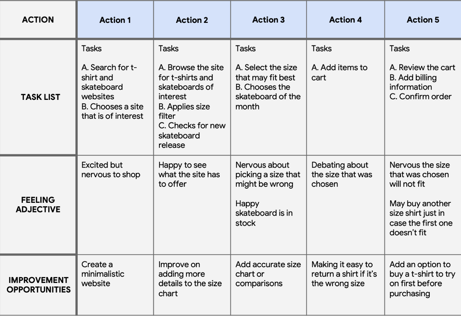
User Journey Map
Developed a user journey map for Jean Luc to understand his overall experience, pinpoint pain points, and identify areas for potential improvement.
Information Architecture
The main challenge users face when navigating websites is information overload, which can be overwhelming. To address this issue, I designed a site map to enhance organization and ensure that information is structured and easily accessible for users.
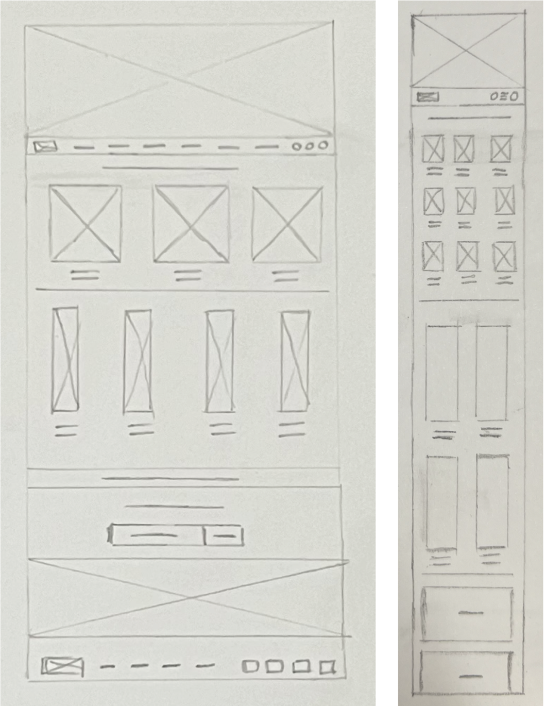
Paper Wireframes
Designed several paper wireframe options to assess which one would be most effective for improving user navigation. A cleaner website tends to have more appeal and user-friendliness. Bitters has the capability to offer both a desktop website and a dedicated mobile app for tech-savvy users. I developed two distinct versions to ensure that the visual appeal is optimized for different formats.
Digital Wireframes
Following the completion of the paper wireframe, I transitioned to creating digital wireframes. This shift allowed me to gain a deeper understanding of how to ensure a successful user experience. My primary goal was to ensure that every aspect of the website maintains a clean aesthetic and offers a straightforward user experience.
Low-Fidelity Prototype
Through the development of a low-fidelity prototype, I connected all the screens to ensure a streamlined and user-friendly experience.
View Bitters Low-Fi Prototype
Usability Study Findings
The user was uncertain about purchasing two different-sized t-shirts to determine which one fits better. This hesitation stemmed from prior negative experiences.
Users still encountered some slight difficulty in reading the information, with some expressing
the need for bolder fonts compared to others.
UI Library Components
Mockups
Upon analyzing the insights gathered from the usability study, I took steps to enhance several aspects. These included improving text legibility by selecting appropriate fonts for critical website content. Furthermore, I redesigned the website to provide users with a more organized and less overwhelming way to access information, while making it look visually appealing.
Recognizing the users' past negative experiences with size charts, I introduced a specific feature. This allows users to select a "Try-On" option before committing to a full payment at the end. If the t-shirt fits well, they can notify the company to process the charge. However, if it doesn't fit, they can alert the company to proceed with the next steps, free of charge.
After usability study
Before usability study
Mockups
Mockups - Responsive Design
I aimed to showcase the website's appearance on both desktop and mobile devices to ensure a uniform user experience, regardless of the chosen format. This approach was intended to create a hassle-free navigation experience for users without any issues.
High-Fidelity Prototype
The high-fidelity prototype maintained the same user flow as the low-fidelity version.Additionally, it incorporated the special feature allowing users to try on the t-shirt before placing an order, inspired by feedback from several users who found it to be a valuable way to build trust in the size
Accessibility considerations
1. I employed bolder fonts to distinguish essential information from other content.
2. I ensured that the website's design is visually appealing and user-friendly, catering to all generations and providing a positive user experience without feeling overwhelming.
3. Used high contrast colors on the website, so it effectively enhances visibility and readability, making the content more inclusive and user-friendly. This plays a crucial role in ensuring that information is easily perceivable and understandable, particularly for individuals with color vision deficiencies.
Takeaways
Users appreciated the ease of navigation on the website, finding it uncluttered and free from distractions, which allowed them to have a seamless and enjoyable experience.I took great pleasure in crafting an engaging website for individuals seeking a versatile company. I recognized the importance of being mindful of typography across two distinct formats. My top priority was ensuring that users could access the website hassle-free, enjoy their experience, and return knowing they had discovered a reliable shopping destination.


